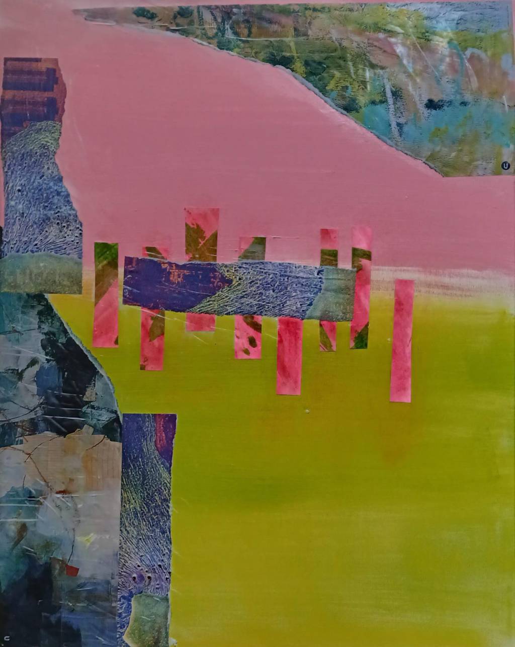
Not as easy as it looks, this abstraction game. I’m learning about values and their importance. We notice value contrast before colour apparently.
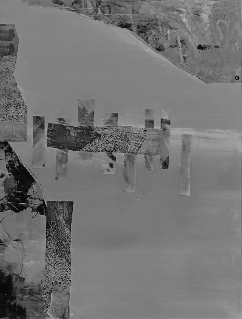

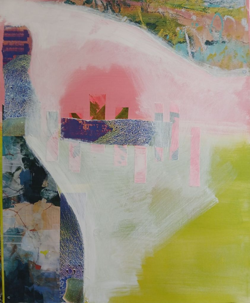
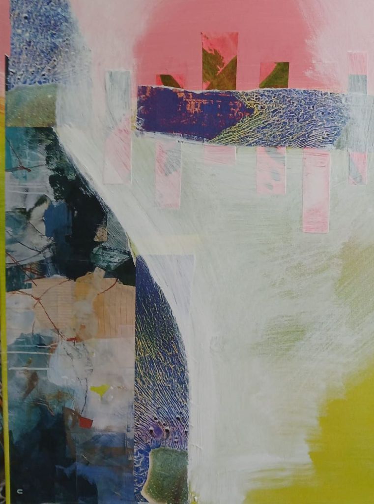
I’m thinking to add more brightness to the areas marked here in blue. Otherwise it’s too samey. Though green and pink contrast nicely, I’d like to give it a more dramatic lift.

Leave a comment